
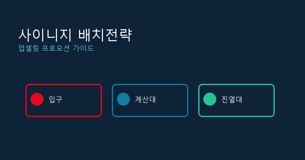
If sales have not moved much since you installed in-store signage, the problem is often placement, not content. The same promo clip can underperform at the entrance and lift average order value at the checkout line, depending on where the decision point actually sits. This guide covers how to place, size, and schedule in-store digital signage so it functions as an upselling and promotion tool, not just a digital poster that happens to be mounted on a wall.
Why Placement Matters More Than Content
Shoppers shift their attention every few seconds as they move through a store. A screen that sits outside the main path of travel, or one that only becomes visible after a purchase decision is already made, will not influence that decision no matter how good the content is. Screens placed at genuine decision points, in front of a display, in a checkout queue, right before a menu choice, create a nudge effect that drives add-on purchases and upgrades. Changing placement is also the cheapest lever available: it costs nothing to move a screen, and the effect shows up immediately, before any content has been touched. In practice, many stores invest heavily in content quality while leaving the placement decisions exactly as they were on installation day, for years at a time.
Placement Strategy by Store Zone
The same screen plays a different role depending on where it sits. Decide the purpose of each zone before mounting anything.
| Zone | Purpose | Content example | Recommended size |
|---|---|---|---|
| Entrance | Dwell time, brand and new product awareness | Daily promotion, new menu or product launch | 43-55 inch, portrait |
| Checkout / queue | Upselling, add-on purchases | Bundle offers, small add-on prompts | 32-43 inch |
| Shelf / menu decision point | Cross-selling, comparison | Related product suggestions, price-tier comparisons | 24-32 inch |
| Tables / seating area | Using dwell time | Desserts, sides, reorder prompts | 24-32 inch |
Sizing Screens for Actual Viewing Distance
A screen that is too small goes unread; one that is too large wastes both space and budget. A workable rule of thumb for indoor signage: a screen viewed from about 5 feet away, such as checkout or a queue, works fine at 32-43 inches, while a screen viewed from 10 feet or more, such as an entrance or far wall, needs 43-55 inches to stay legible. Mount height matters just as much as size: keep the center of the screen roughly at average eye level, around 5 feet off the floor, and keep the vertical viewing angle within about 15 degrees of that line. Outside that range, a screen is technically visible but functionally unread.
Designing Content That Actually Upsells
- Lead with the combination, not the price: show the bundle image first, then price, then the benefit
- Frame the incremental cost, not the total, such as upgrade for a small add-on fee, to lower the decision friction
- Only use scarcity language such as limited stock when it is tied to real inventory data, otherwise it erodes trust fast
- One message per screen at a time: stacking multiple offers does not increase dwell time, it just gets ignored
- Checkout-line dwell time typically runs 10-20 seconds, so keep copy to five words or fewer that can be read at a glance
Timing Promotions Around Real Store Behavior
Rotating content by time of day beats leaving one loop running all day. For example, switch to combo-meal content 30 minutes before the weekday lunch peak around 11:30 a.m. to 1:30 p.m., and auto-switch to discounted, close-to-expiry items two hours before closing. Building separate schedules for weekday versus weekend, or rainy versus clear days, means staff are not manually swapping content; the system handles the condition-based switching on its own. During a new product launch week, it is also worth weighting exposure toward the entrance screen for awareness, then shifting that same content to checkout and shelf screens in weeks two and three, moving the shopper from simple awareness to a prompted purchase.
Measuring Whether Placement Is Working
- Compare sales and average order value for the same day of week and time slot, before and after a content or placement change
- Where possible, run an A/B test with two screens in the same store showing different content
- Cross-reference the content playback log against POS sales timestamps to see whether order value rose specifically during the windows a given promo was on screen
- Measure over at least two weeks, since shorter windows get distorted by ordinary day-of-week swings like weekend traffic
- Track the metric that actually matters for the change being tested: average order value for upsell content, units per transaction for cross-sell content, and foot traffic conversion for entrance content, rather than one blended number for every screen
Common Placement Mistakes to Avoid
- Mounting screens above or below natural eye level, outside the normal viewing angle
- Placing signage only at points where the purchase decision is already final, such as right after checkout
- Leaving the same promotional content running for weeks without rotation
- Using the screen purely as a menu board with no upsell messaging at all
- Running identical content across every location regardless of peak hours or best-selling items at each site
Rolling This Out Without Overhauling Everything
None of this requires replacing hardware. A typical rollout looks like: pick one store, map its existing screens against the zone table above, and fix the one or two placements that are clearly in the wrong spot, usually a checkout screen mounted too high, or an entrance screen doing double duty as a menu board. Build two or three time-based schedules for that store first, such as a lunch-peak switch and a closing-time discount switch, and run them for two weeks before touching anything else. Only after that single store shows a measurable lift in average order value is it worth rolling the same zone-based logic out to the rest of the chain. Trying to redesign every screen in every location at once usually stalls, because nobody can tell afterward which specific change moved the number.
Getting placement, sizing, and scheduling right means running things differently by location and by time of day, and once more than a handful of screens are being managed across multiple stores, updating each one by hand stops being realistic.
If you manage multiple signage displays or kiosks, take a look at Y-Board, a cloud-based signage CMS.